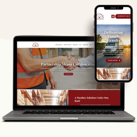
These days, there are phone apps for everything. The reason is simple: Companies know that their Twitter, Facebook, and other social media posts can easily be read by the “on-the-go” American using their smart phone or tablet; however, companies can run into mobile device accessibility problems when their customers and prospects try to access websites and emails that aren’t properly configured to be viewed on mobile devices. The result? Less user engagement and more user upset.
So if your company wants more customer engagement and prospect attraction, be advised: Emails and websites that don’t show up or seem broken can severely lower interest and cause frustration for viewers.
To help you create mobile web pages that allow your company’s eMarketing messages to be read easily on mobile devices, here are five tips:
- Avoid requiring users to do a lot of typing and instead, provide large, actionable, clickable features.
- Put most of the important information at the top of the web page.
- Use images and graphics as little as possible and only when contextually relevant in the web content.
- Keep the web page size small (maximum page size is only 20 kb).
- Provide links to your other web pages and back buttons for ease of navigation.
Interested in making sure that your company’s marketing messages are accessible on mobile devices? Our Autumn Consulting team can help your business clarify messages to create web pages and emails that are effective and accessible to mobile device users. We’re a web marketing agency serving Milwaukee and other Wisconsin/Chicago area clients. Contact us today to get started.


